
How to Create a Mobile Popup (Without Hurting SEO)
52.27% of the global traffic comes from mobile visitors, but most popups are still built for desktop. This guide shows you how to create a mobile popup that fits the screen, stays on Google's good side, and turns visitors into leads. You'll get the exact size, timing, and trigger rules that work on phones.
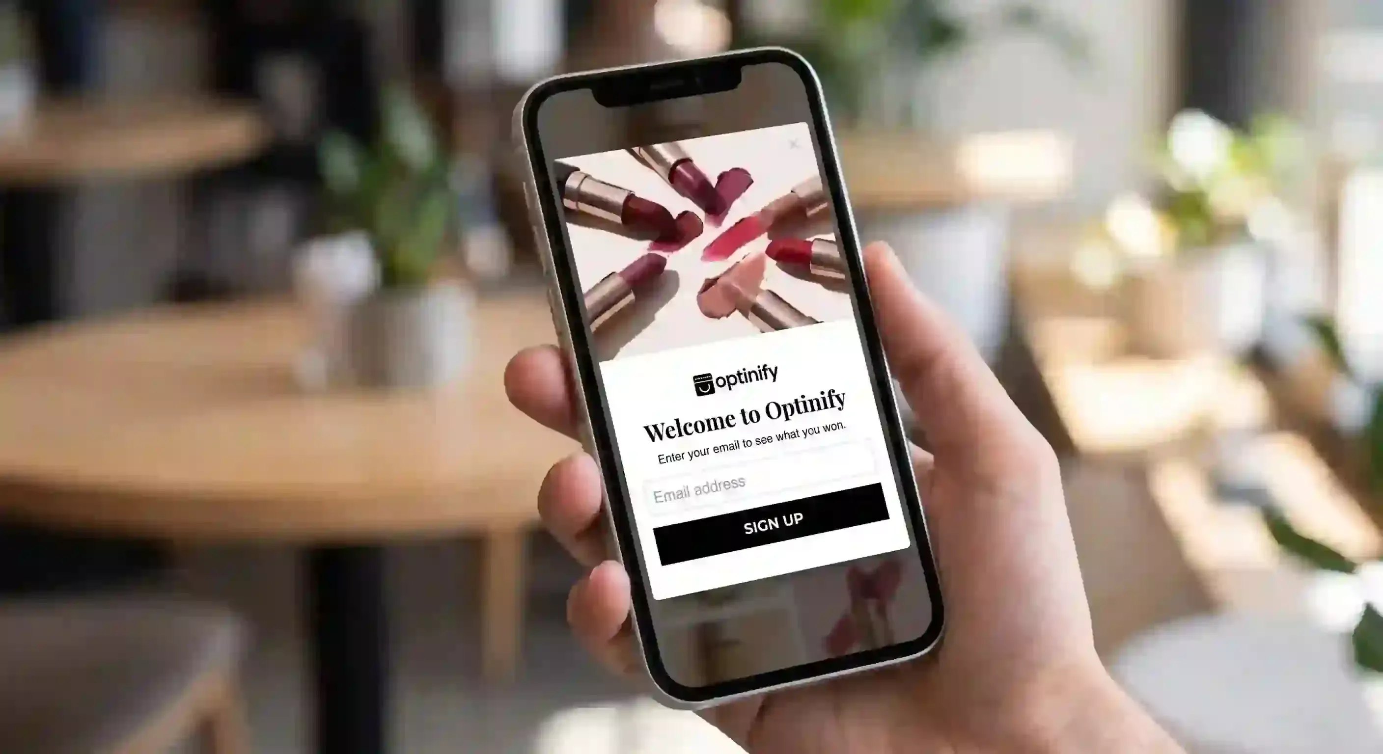
Want to know how to create a mobile popup?
This guide shows you how to create one. It will meet Google’s requirements. It will also provide a great user experience on your website.
What is a mobile popup?
Mobile pop-up is an interactive overlay. It is designed for mobile devices to capture leads, promote offers, and reduce cart abandonment.
You can create any type of pop-up for mobile, such as:
- Welcome popup
- Exit-intent popup
- Cart abandonment popup
- Gamified popup
- Time-delayed popup
- Lightbox popup
- Floating bar popup
- Full-screen popup
Mobile popup templates
Do you know which templates are the most popular among mobile users?
- Floating bar timer
- Lightbox
- Full-screen popup
Visit the Optinify Popup Template Gallery.
Mobile pop-ups for Shopify stores
Best Shopify popup apps let merchants create popups. They can be beautiful and engaging.
Optinify is a Shopify popup app. It offers many templates, trigger rules, analytics, and integrations. Plus, it has even more features. These popups not only engage the store visitors but also speed up revenue.
How to create a mobile popup with Optinify
To make a mobile popup for your Shopify store, use Optinify. Follow these steps:
- Add Optinify to your store from the Shopify App Store
- Choose a template
- Use your brand’s theme
- Customize the design
- Add the discount
- Add trigger rule & preview
- Publish your pop-up
Step 1: Choose a template
Once you are in the Optinify dashboard, go to ‘Create Campaign.'
You can see all the templates there.
Pick one based on your goal:
- Capture emails
- Reduce cart abandonment with exit intent
- Drive sales with flash sales and free shipping
- Inform users about cookie disclaimers or age verification
- Collect user feedback
Step 2: Use your brand’s theme
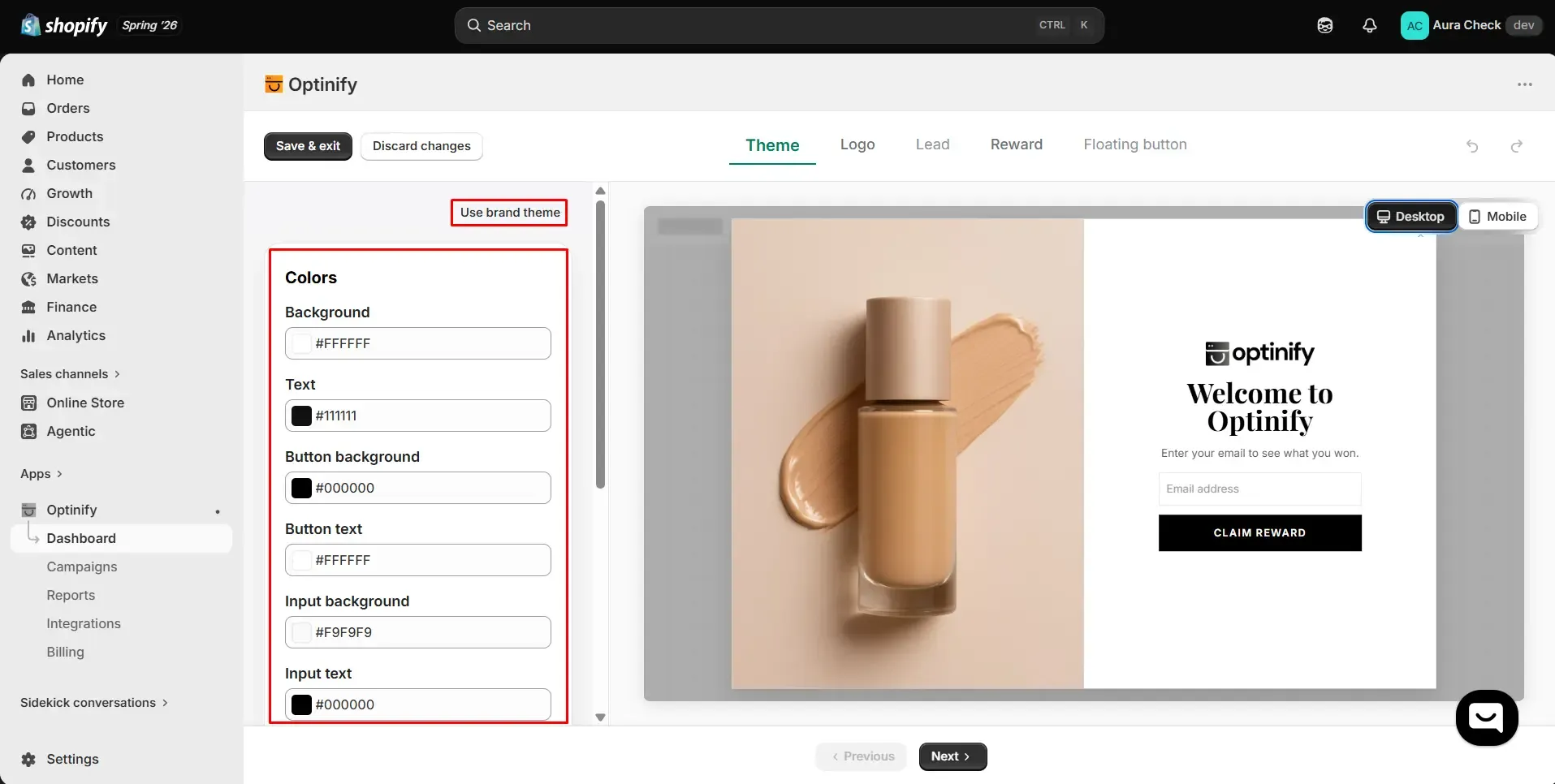
With one click, you can bring your brand theme, or you can customize it using the canvas.
Everything is customizable.
Step 3: Customize the design
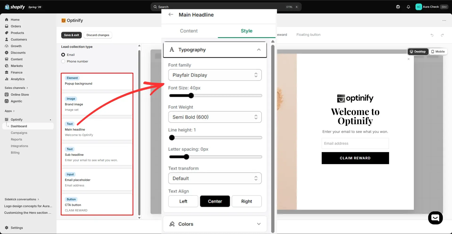
Use the canvas on your left.
You can change every element.
Here are the elements to include:
- Background color
- Image
- Font
- Heading
- Subheading
- Email placeholder
- CTA button
Step 4: Add the discount
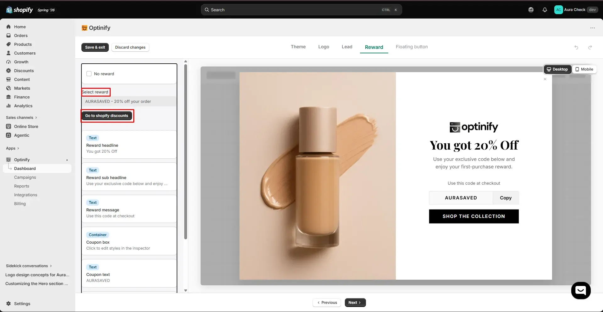
If you have a previously created discount, you can select that.
If you don’t have a discount yet, click “Go to Shopify discount”. Create your discount, and come back to the previous tab. Then select your discount.
Step 5: Add trigger rule & Preview
You have finished creating the popup.
Now you can add the trigger rules as needed and preview the pop-up
Step 6: Publish your pop-up
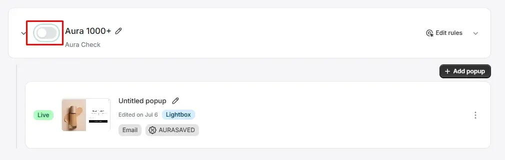
Tap this button to publish & relax.
Mobile popup best practices
According to Google, popups are good until they disrupt mobile usability.
Let’s discuss the best practices of mobile popups.
Core specifications for mobile popup
Mobile Popup Design Guidelines
Mobile popup timings & triggers
Trigger by behavior
Trigger by specific URLs and products
Trigger by user type
Trigger by device type
Common mistakes to avoid
- Oversizing the popups
- Designing tiny, hard-to-tap close buttons
- Poor color contrast and readability
- Using fixed pixel widths instead of responsive designs
- Triggering the popup immediately upon page load
- Displaying many popups during a single session
- Interrupting the active checkout process
- Using vague value propositions
- Requesting too many form fields
- Offering weak or demotivating incentives
Frequently Asked Questions
Mobile popup: Wrap-up
52.27% of the global traffic comes from mobile visitors.
Without any confusion create mobile popups for your visitors. And capture the traffic to convert.
What to read next
Spin to Win Popup: How Shopify Stores Can Grow Email Signups and Sales
Learn how spin to win popup actually work! Discover the best prizes and perfect timing strategies to boost conversions and grow Shopify sales.
Read Article
Gamified Popup Guide: Types, Examples & Best Practices
Learn how gamified popup help Shopify stores grow leads and sales. Compare game types, prize ideas, targeting tips, and best practices.
Read Article
Cart Abandonment Popup: 7 Examples & Best Practices (2026)
Cart abandonment popups catch shoppers before they leave. Get 7 examples, trigger types, discount rules, and copy formulas that convert.
Read Article