Discount Popup Examples & Best Practices for 2026.
Learn 12 high-converting discount popups
Getting traffic to your Shopify store is hard, but 98% of visitors leave without buying. To stop them and capture those lost sales, you need an effective discount popup.
We analyzed the best online stores and e-commerce businesses to find strategies that work. By offering the right marketing offers at the perfect opportunity, you can turn your visitors into satisfied customers.
Discount Popup Strategies: Best Practices for Success
Before we look at the designs, we need to understand the strategy. A popup window only works if it feels fair and valuable. Here are the golden rules used by conversion experts.
The "Rule of 100" for Your Discount Popup

Here’s a simple trick for your sales promos. It helps you decide whether to use a percentage or a dollar amount to make your marketing offers seem more appealing.
- If your item costs less than $100, use a percentage discount, like 15%. People tend to see 15 as bigger than 5 or 7 dollars.
- For items over $100, use a flat dollar amount ($20 off) to drive purchase completion.
Perfect Timing and Triggers

Avoid being too aggressive. If you show promotion popups as soon as someone arrives, they will leave. Instead, look for the right moment:
- Time Delay: 5 to 10 seconds for email sign-ups.
- Scroll Depth: Display the popup when the user has scrolled halfway down the page.
- Exit-Intent: Catch their attention right as they move to the checkout or close the tab.
Mobile-First Design

These days, most people shop using their phones. If your discount popup is tough to close on a small screen, visitors may get annoyed and leave. Use a large, easy-to-tap "X" button, and keep the text readable without zooming in.
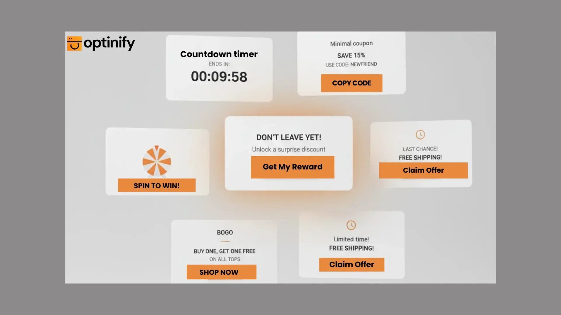
12 High-Converting Discount Popup Examples
Now, let's look at the patterns that actually drive sales. Use these to inspire your design.
1. The "First Purchase" Welcome Discount Popup

This greets new visitors and gives them a reason to start shopping immediately. It is one of the top reasons strangers become customers.
2. The "Don't Go" Exit-Intent Discount Popup

Appearing right before someone leaves, this is your final chance to offer unique coupon codes and save the sale.
3. The "Spin-to-Win" Game

Gamification is a popular channel for engagement in 2026. People feel like they "earned" their discount code, making them more likely to use it at checkout.
4. The Cart Recovery Reminder

If a customer has items in their cart but hasn't paid, show them a countdown offer. This creates urgency and removes the last barrier to purchase completion.
5. The "Join the VIP Club"

Invite people into a community. This is a great way to handle zero-party data collection and learning what your customers like while offering them exclusive sales promos.
6. The BOGO (Buy One Get One)

Highlight a specific discount code like "Buy one t-shirt, get the second one for 50% off." This is perfect for clearing inventory and one of the most effective sales promotion examples used by top Shopify stores.
7. The Free Shipping Threshold

“You are only $10 away from free shipping!" This message turns a small sale into a larger one by encouraging upsells.
8. The Limited-Time Countdown Offer

Adding a timer helps create a sense of urgency. The right Shopify popup app makes it easy to add countdown timers to your store in minutes without any developer.
9. The Social Proof Popup

"Join 10,000 other shoppers." When people notice that many others have already used your marketing offers, they feel more comfortable buying.
10. The Discount Survey Popup

Instead of a flat offer, try a discount survey. Ask what they are looking for. This helps with zero-party data collection so you can send them better offers later.
11. The Holiday Special

Change your design for Cyber Monday or Mother's Day. Seasonal promotion popups show that your store is updated and relevant.
12. The "Secret" Unique Coupon Codes

"Click here to reveal your mystery discount." Curiosity is a powerful human emotion that leads to higher email sign-ups and engagement.
Simple Discount Popup Mistakes That Cost You Sales
Even with the best marketing offers, you can still fail if you make these common errors:
- Asking for Too Much: Keep your email sign-ups simple. Just ask for the email address.
- Vague Headlines: Instead of "Sign up," try "Get my 10% discount code."
- Slow Loading: A slow popup window will frustrate your users. Use a fast, reliable tool for your store.
SEO Tips: Make Sure Google Loves Your Discount Popup
Google prefers ecommerce businesses that prioritize the user experience.
Focus on Page Speed
Google prefers websites that load quickly. Choose a lightweight app to keep your store running fast. A slow site can hurt your search rankings.
Avoid Intrusive Interstitials
Google uses this term for pop-ups that take over the whole screen on mobile devices. To stay SEO-safe, make sure your discount popup covers only a small part of the screen or triggers only when the user tries to leave.
High-Contrast Buttons
Make sure your "Claim Discount Code" button is easy to spot. Use a color that stands out from your background. This makes things easier for your users and can improve your conversion rates.
Is Your Discount Popup Working?

Keep an eye on your results to see if your sales promos are hitting the mark:
- Conversion Rate: Aim for 3–7% for email sign-ups.
- Revenue per View: How much money do you earn from each popup window?
- Bounce Rate: Are visitors leaving faster? If so, change your timing.
Ready to Sell More with a Discount Popup?

A discount popup is a simple way to boost your sales. If you follow the "Rule of 100" and choose the perfect opportunity, you can help turn visitors into customers.
Whether you use upsells, unique coupon codes, or a simple welcome offer, aim to be helpful instead of bothersome. Great ecommerce businesses keep trying new ideas. Pick one of the 12 examples above and test it on your store today. And if you want to see how discount popups fit into a bigger growth plan, explore our full Shopify marketing strategy guide.