

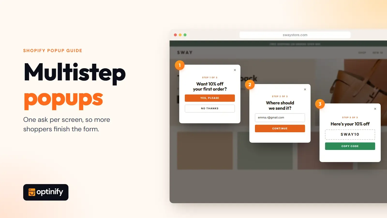
Multistep popups split one signup form into two or three short screens. Each screen asks for one thing, so the form doesn't overwhelm anyone.
The pitch is simple. A multi-step form asks for less at a time, so more people finish and your conversion rate goes up.
This guide covers when multistep popups pay off on a Shopify store, how many steps to use, and how to build one that doesn’t leak signups between steps.
What are multistep popups?
Multistep popups (also written multi step or multi-step pop-ups) are popup forms that show their content across two or more screens instead of one. A visitor answers a question or enters an email on the first screen, then moves to the next. Most stores use two or three steps: an offer, a second ask, and a confirmation screen with the discount code.
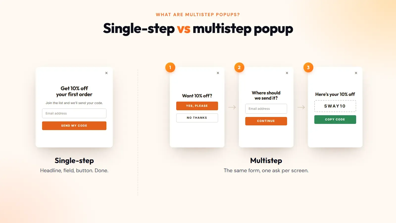
Single-step forms put everything on one screen. Headline, field, button, done.
The multistep version spreads that out, usually in a lightbox. Think of it as a small funnel inside one popup. A common flow looks like this:
- "Want 10% off your first order?" with Yes and No buttons.
- An email field.
- An optional phone field for texts.
- The code.
It's one of the 29 popup types we've covered before.
Do multistep popups boost conversions over single-step forms?
Sometimes. No independent benchmark proves that multistep popups beat single-step forms.
The idea behind them is sound. Showing less on each screen makes a form feel easier, and people who take one small step tend to take the next. Expect a modest gain at best, and test it on your own store.
When should you use multistep popups?
Use a multi-step form when you want a second piece of information and a single form would look crowded. Phone numbers, product preferences, and quiz answers are the usual use cases.
If you only want email addresses, a one-field popup is simpler to build, faster to fill in, and just as likely to convert.
Shopify's email popup guide shows how real brands use multistep popups. Baby clothing brand MORI first asks who the visitor is shopping for, in exchange for 10% off. Expecting parents then get a second step that asks for the due date. MORI uses it to time campaigns around the birth.
That's the test for any extra step. Will the answer change what you send?
Here are three popup examples where it does.
Email first, then SMS
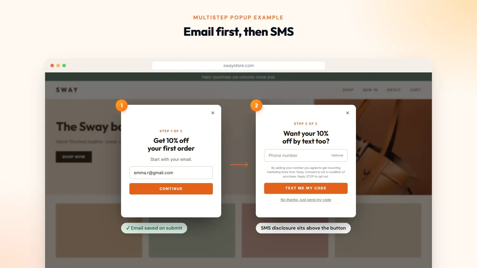
This is the most common setup on Shopify. Step one takes the email. Step two offers something extra to visitors who provide their phone numbers.
The order matters. As long as your tool saves each step when it's submitted, a visitor who quits at step two is still on your email list.
Keep the phone step optional. Jacob Sappington, email strategy director at Homestead Studio, told Shopify that when the step is optional, about half of email subscribers also join the SMS list.
There's a legal reason for the separate step too. In the US, marketing texts need prior express written consent under the TCPA. The rule requires a clear and conspicuous disclosure, and you can't make consent a condition of buying.
One checkbox can't cover both email and texts. A separate step gives the SMS disclosure its own space. Our SMS popup guide has sample wording.
A question before the form
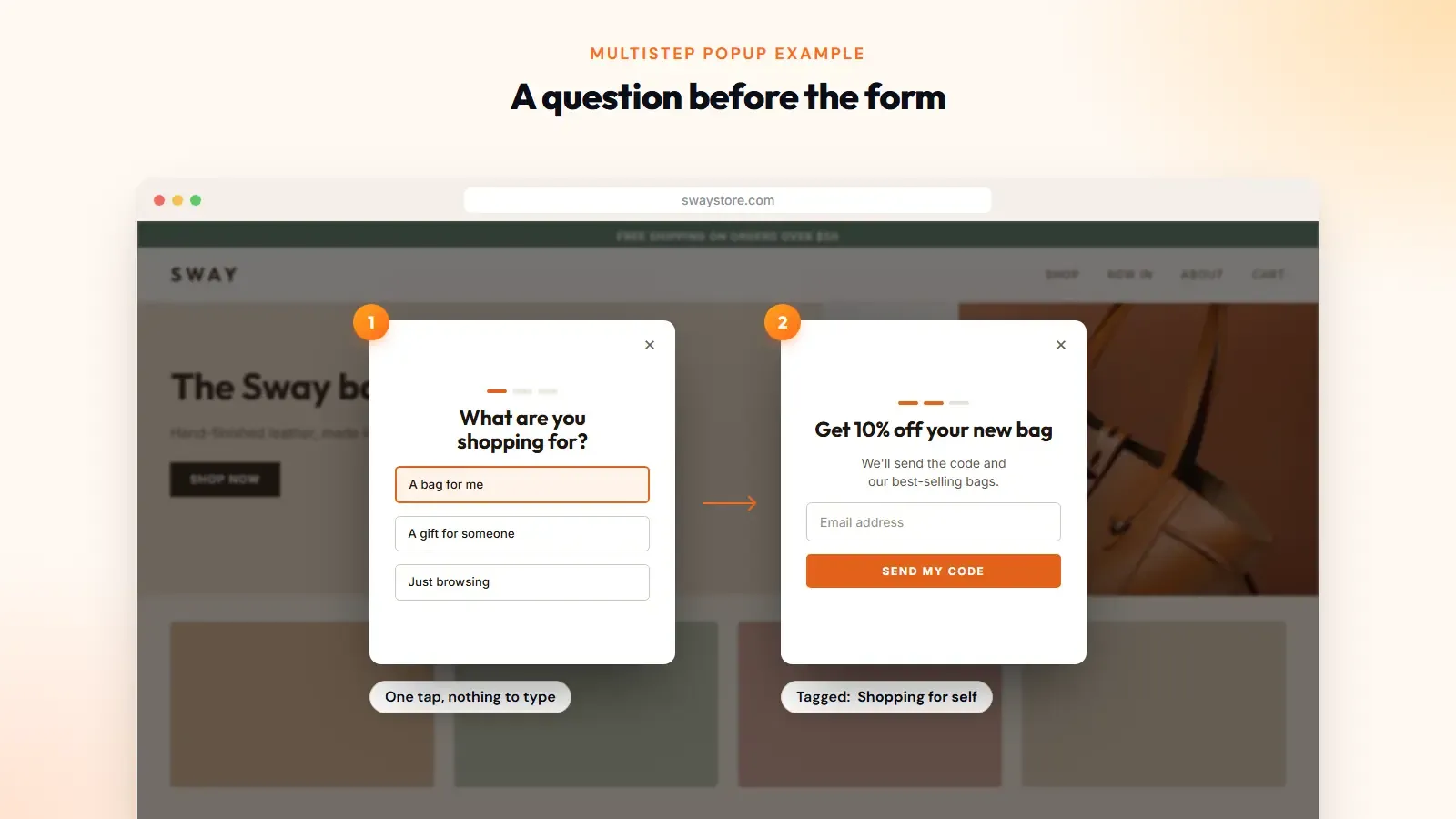
Some stores open with a question. "What are you shopping for?" or "What's your skin type?"
You get two things. The visitor makes a small commitment before seeing a form. And you collect zero-party data you can use to segment your welcome emails.
In Optinify, this is the mini quiz. You add the quiz as a pre-hook to a popup campaign, and the questions run before the signup step. Two to four questions is plenty.
A game with a second reward
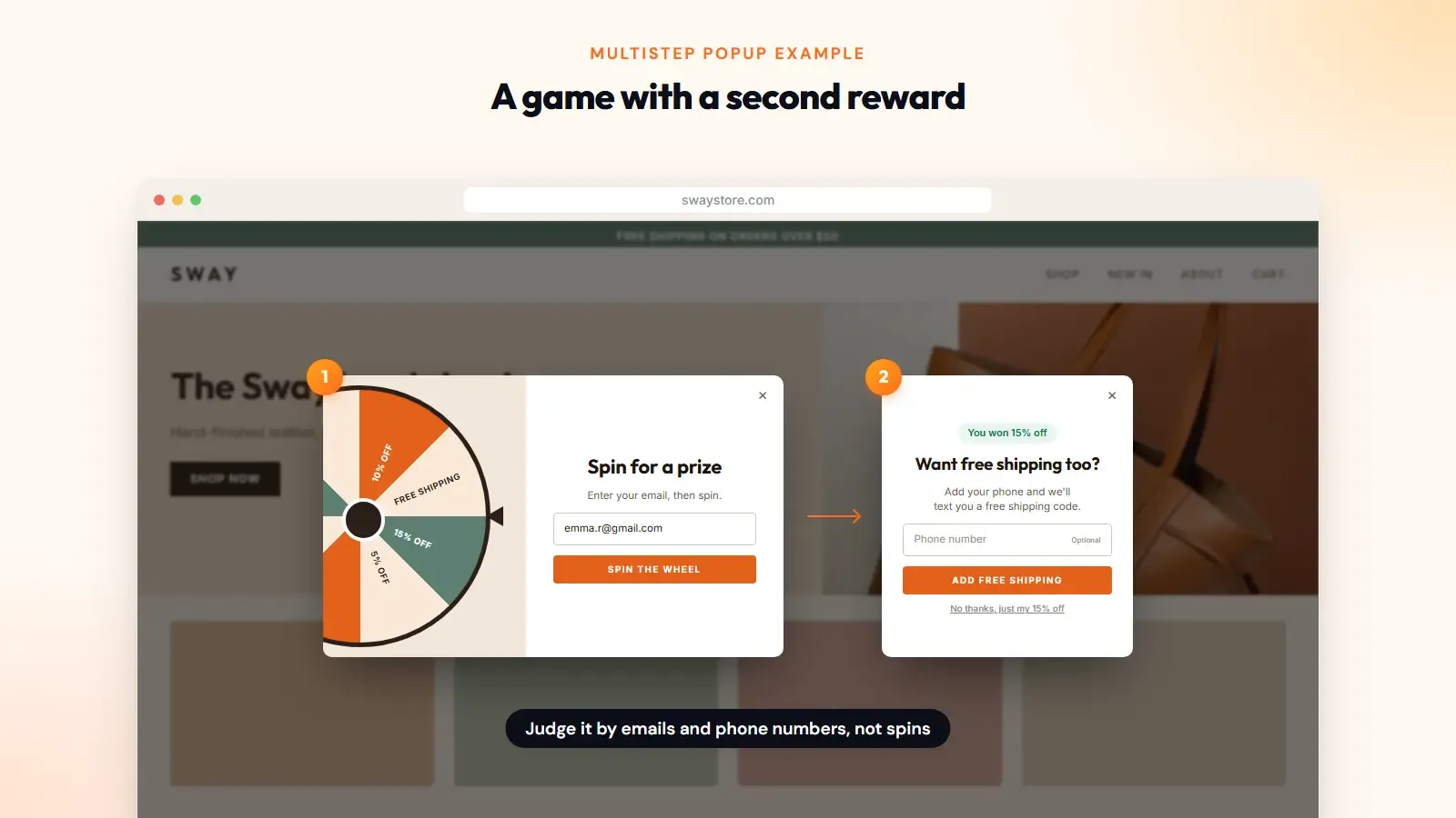
Spin-to-win and other gamified popups are already multistep popups: trigger, entry, game, reward. Some stores add a second prize for a phone number.
Count these carefully. A spin is only a click. Judge the game by the emails and phone numbers it collects.
How many steps should multistep popups have?
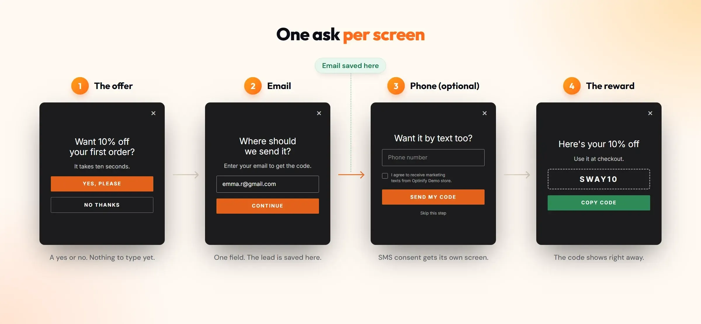
Two or three for most stores. That covers an email step, one more ask, and a success screen with the code. Every added screen is another place to quit.
Mobile makes the limit stricter for multistep popups. Mobile drives 78% of all ecommerce traffic but only 70% of orders. Most of your visitors will meet the popup on mobile devices.
Few people will type through five screens on a phone to save 10%.
Read more
Best practices for building multistep popups
- Start from what you'll use. If your popup app has a multi-step template, begin there. Then list the data your email and SMS flows need. Drop the rest. A birthday field is pointless without a birthday email.
- Make step one the easiest. Use a Yes/No button or a single email field. Don't open with a phone number.
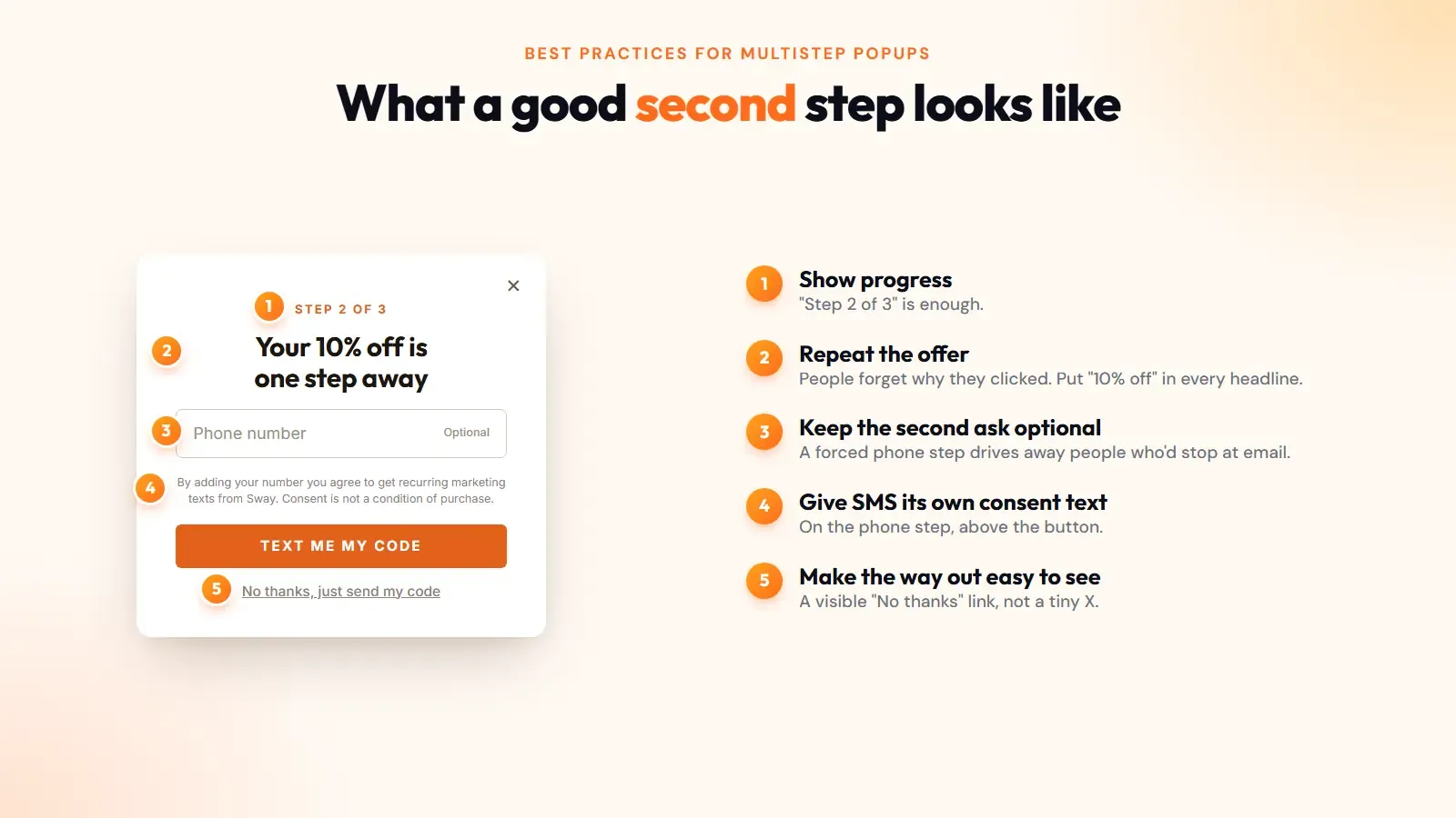
- Repeat the offer on every screen. People forget why they clicked. Put "10% off" in each headline.
- Keep the second ask optional. Add a visible "No thanks, just send my code" link. A forced phone step drives away people who'd have happily stopped at email.
- Give SMS its own consent text. Show the disclosure on the phone step, above the button.
- Show progress. "Step 2 of 3" is enough.
- End with the code on screen. The shopper is ready to buy now, so don't send them to their inbox first. Email the code as a backup.
- Target it. Show it to new visitors after a short delay or on exit intent, and hide it from people already on your list. Our popup targeting guide covers the rules.
How to measure the conversion rate of multistep popups
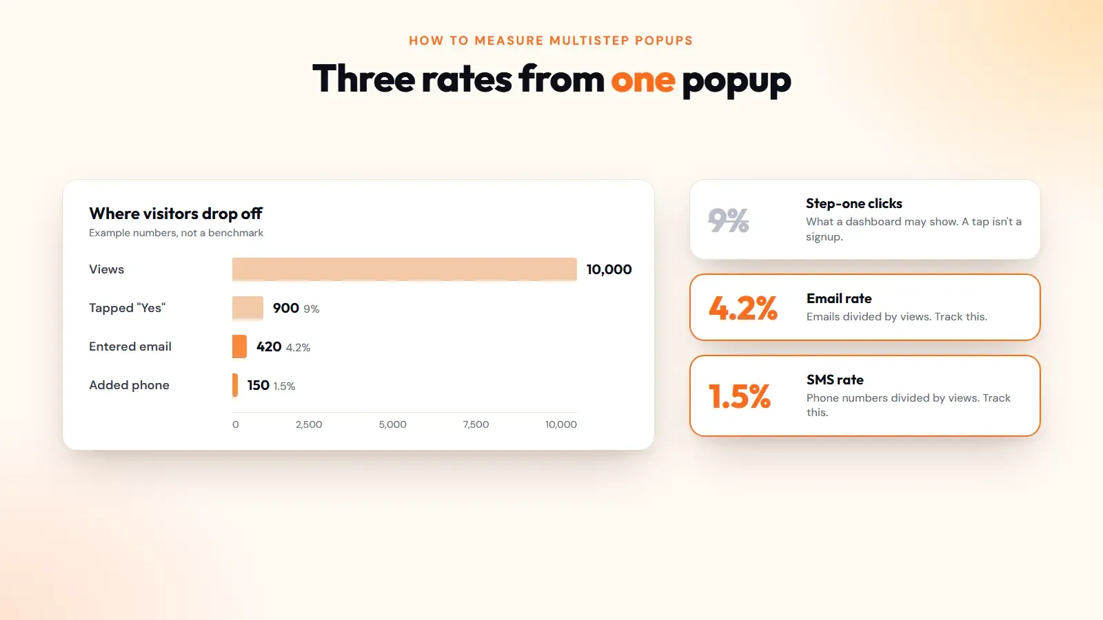
Track four numbers: views, step-one completions, final submissions, and revenue from those subscribers. Your real conversion rate is final submissions divided by views.
Then look at the gap between step one and the last step. A big gap means the second ask is too heavy, or the reward is too small. Optimize that step before you touch anything else.
Here's the math with made-up numbers. A popup gets 10,000 views. 900 people tap "Yes". 420 enter an email. 150 add a phone number.
If your popup dashboard counts step-one clicks, it shows a 9% conversion rate. Your real email rate is 4.2%, and your SMS rate is 1.5%. That’s three different stories from one popup, so track the last two.
To know whether multistep popups work for your store, run one against your current single-step popup with the same offer. Optinify has A/B testing built in, and our popup A/B testing guide explains how long to run a test. Pick the winner by emails collected.
Mistakes that hurt the user experience
- Asking for the phone number first.
- Hiding the real length. If there are three screens, say so.
- Adding a step that only exists to look interactive.
- Making the SMS step mandatory.
- Losing the step-one email when someone closes step two. Test this yourself before launch.
- Shrinking a desktop layout onto a phone. A poor user experience on mobile costs you most of your traffic.
Should you switch to multistep popups?
If your one-field email popup converts well and you don't send texts, leave it alone. A short form with a good offer is still the easiest way to grow an email list.
If you want SMS subscribers or preference data, multistep popups are the cleanest way to ask. Build a two-step version, test it against what you have, and keep whichever collects more subscribers.
Optinify includes popup templates, the mini quiz, targeting rules and A/B testing on every plan, with a 14-day free trial. Install Optinify from the Shopify App Store and run the test this week.