
Popup Best Practices: Design, Timing and Examples
Learn 30 popup best practices for better timing, design, targeting, mobile UX, and conversions. See practical website popup examples.
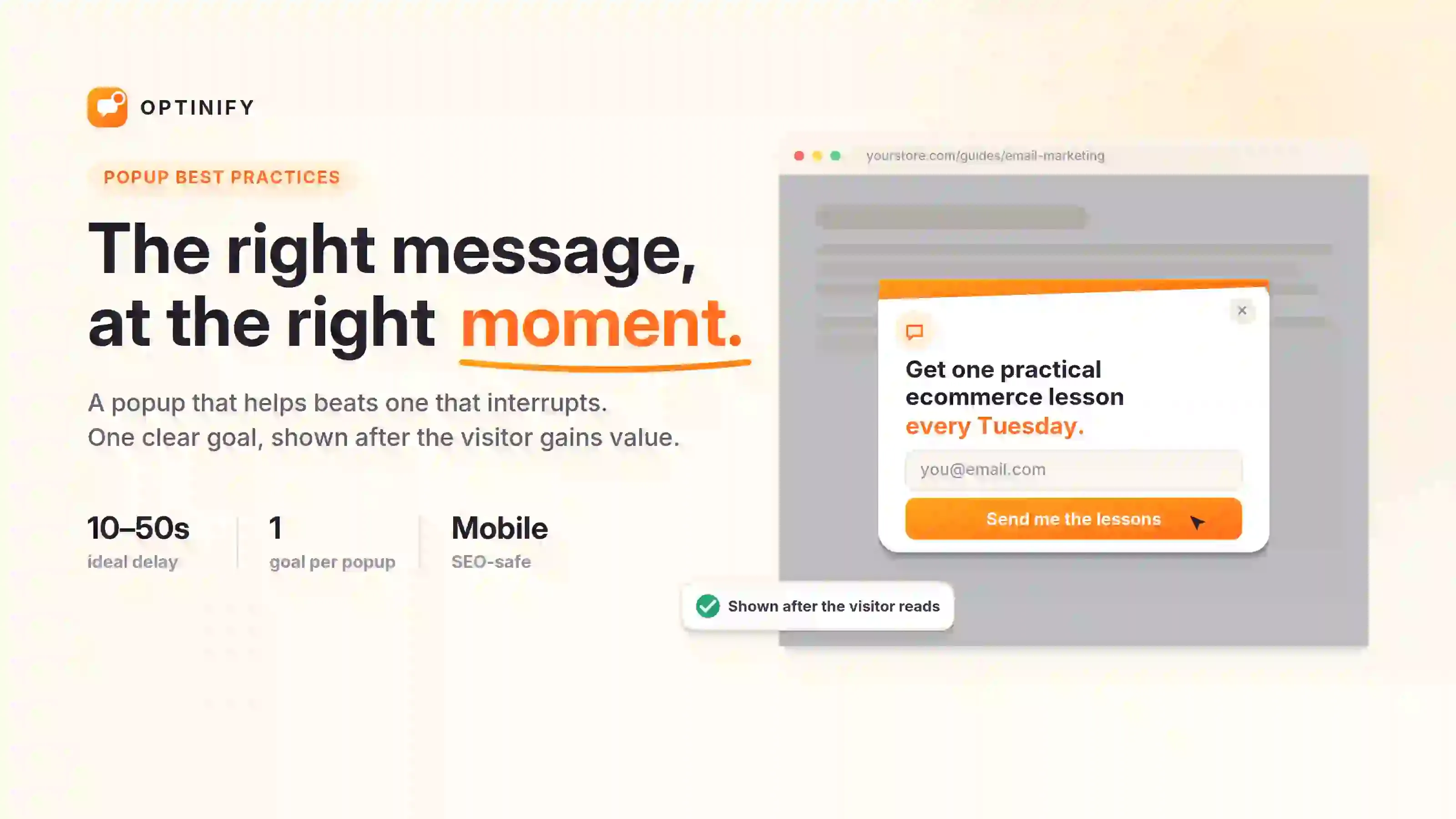
Popup best practices help you show the right message to the right visitor at the right time without disrupting their browsing experience.
Popups can help you grow your email list, collect feedback, recover abandoned carts, or promote special offers. But if a popup is poorly designed, it can interrupt visitors, cover up important content, and make people trust your site less.
A website popup does not chase every possible conversion. Instead, it shares one helpful message and lets visitors decide what to do next.
What are popup best practices?
Popup best practices are simple guidelines for creating, targeting, showing, and tracking website popups.
These rules cover the popup goal, audience, trigger, offer, design, copy, accessibility, frequency, and performance.
I believe that relevance is more important than how a popup looks. Even a simple popup with the right offer can work better than a great-looking one that shows up in the wrong place.
Optinify pro tip: You can also read more about what a is a popup?
A quick look at popup best practices
Here is what makes a good popup:
- Focus on a single clear goal
- Match the content on the page
- Appear after the visitor gains value
- Target the right audience
- Give a clear benefit
- Use short and direct copy
- Include an obvious close button
- Make sure it works on mobile devices
- Support keyboard and screen reader users
- Don’t show the popup too often
- Track business results, not only clicks
- Be honest with your offers and urgency
Should you use a website popup?
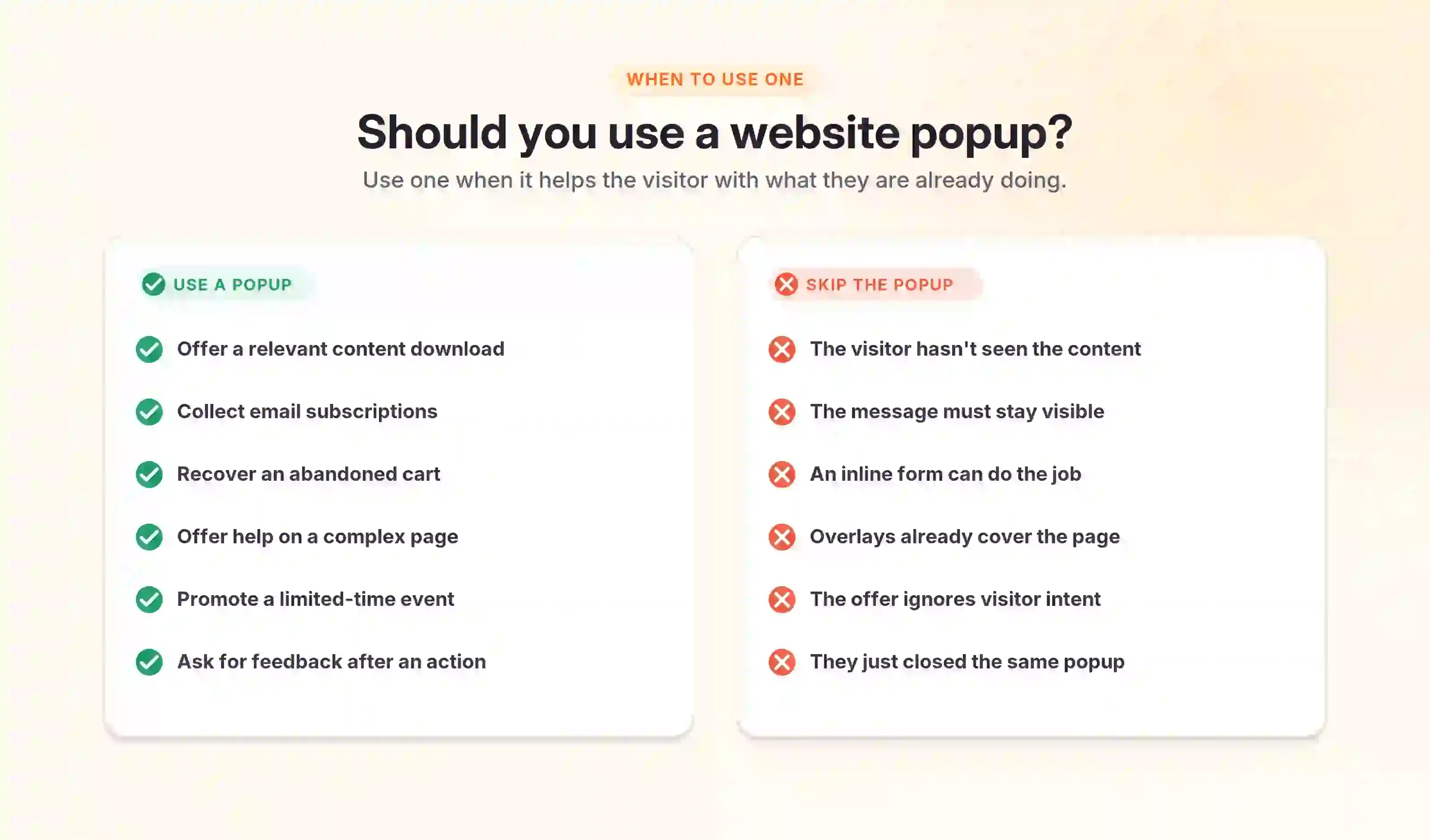
Use a popup when you have a message that needs quick attention and helps the visitor with what they are doing.
Good reasons to use a popup
A popup can work well when you want to
- Offer a relevant content download
- Collect email subscriptions
- Recover an abandoned cart
- Offer help on a complex page
- Promote a limited event
- Announce an important update
- Ask for feedback after an action
- Help visitors choose a product
- Confirm a sensitive action
- Show information requested by the user
When a popup is the wrong choice
Avoid a popup when it interrupts a critical task.
It’s also best to avoid popups when:
- The visitor has not seen the main content
- The message must remain visible
- An inline form can handle the task
- Several overlays already cover the page
- The offer has no link to visitor intent
- The visitor recently closed the same popup
- The visitor already completed the action
- The popup would hide important mobile content
I think marketers use full-screen popups too much. A floating bar or slide-in often shares the same message without being as disruptive.
Optinify Pro Tip
Check the popup templates for getting an alternative.
Popup best practices for choosing the right popup type
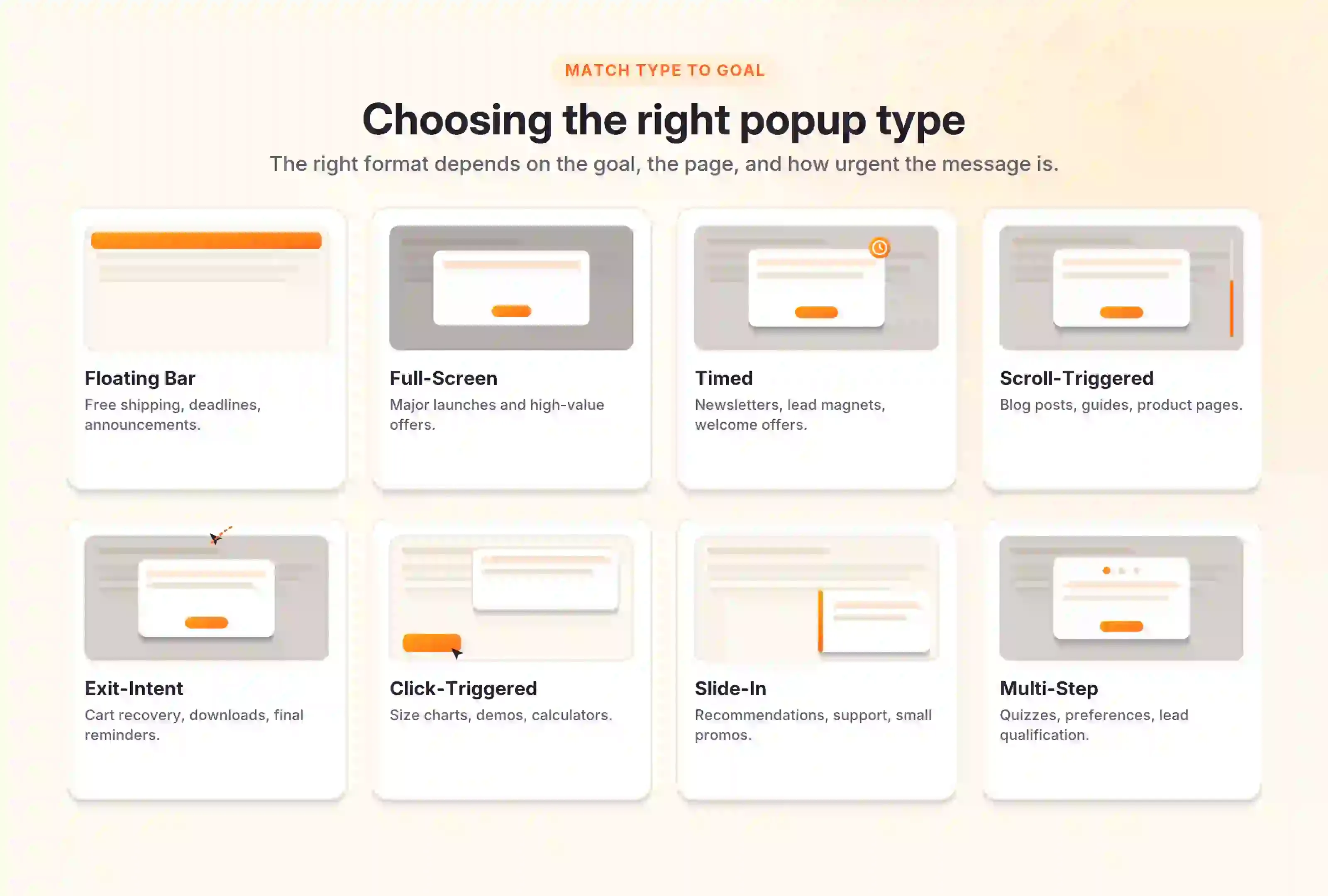
The right popup type depends on the goal, audience, page, and level of urgency.
Popup best practices for choosing the right popup type
Optinify Pro Tip
Read more on lead magnets.
30 popup best practices
Popup strategy and relevance
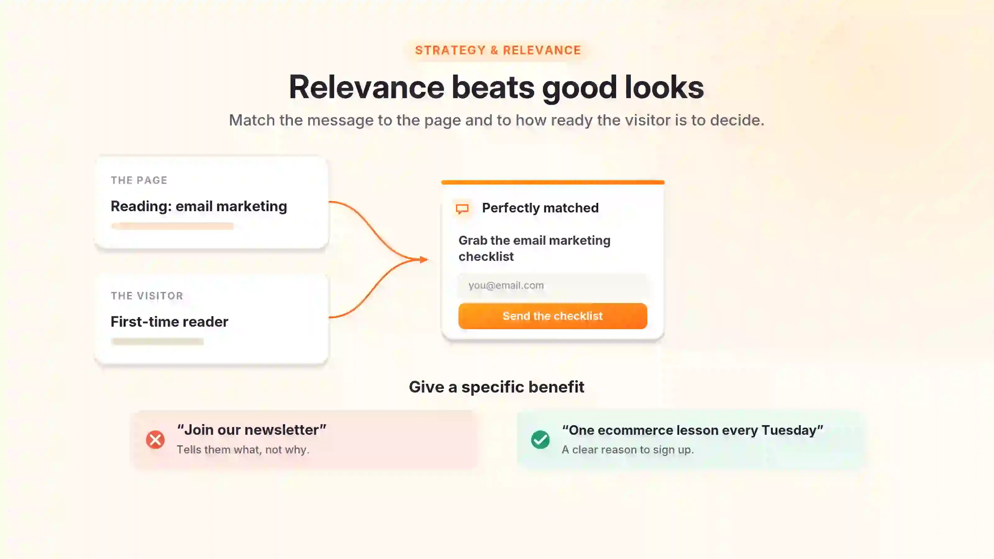
1. Give every popup one clear goal
Each popup should focus on a single main action.
This action could be joining a list, claiming an offer, answering a question, viewing a product, or returning to a cart. Make sure visitors can understand the goal within a few seconds.
2. Match the popup to the customer journey
Popups should match how ready the visitor is to make a decision.
A first-time blog reader might be interested in a helpful guide. Someone comparing products may appreciate a quiz, reviews, or a size guide.
3. Match the message to the page
A good popup should relate to the topic of the page the visitor is on.
A visitor reading about email marketing may want an email checklist. A visitor viewing winter coats may respond to a coat size guide or free shipping offer.
4. Offer a specific benefit
Make sure visitors know exactly what they will get.
Saying “Join our newsletter” tells visitors what to do, but not why. “Get one practical ecommerce lesson every Tuesday” gives them a clear reason to sign up.
5. Exclude people who should not see the popup
A good campaign pays as much attention to who shouldn’t see the popup as to who should.
Do not show a signup popup to someone who already subscribed. Do not show a first-order discount to a returning customer who already used it.
Popup timing and triggers
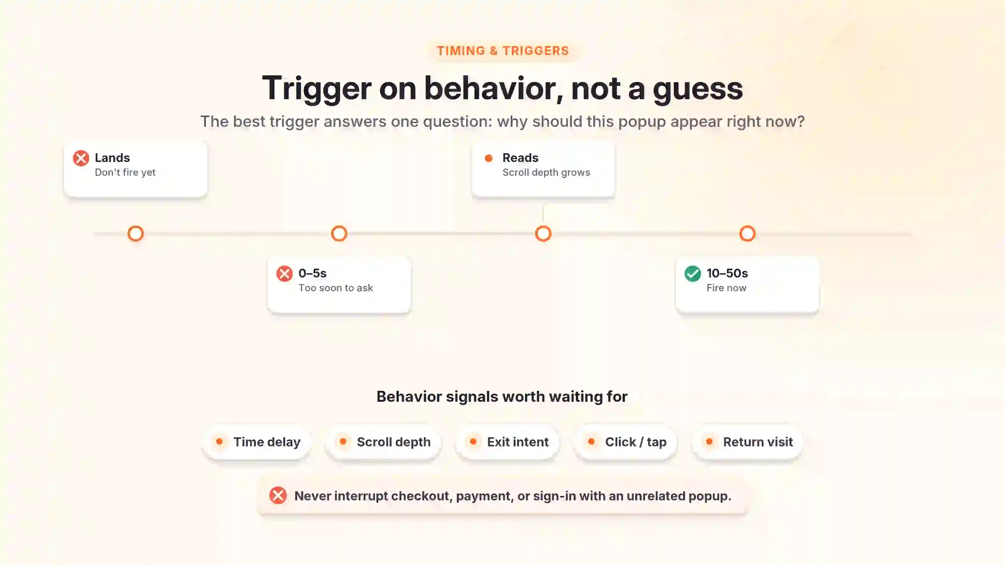
6. Give visitors time to understand the page
Don’t show a popup before visitors have a chance to see what the page is about.
Popups that appear right away can make a bad first impression. They ask for attention too soon, so visitors often close them without reading.
7. Use behavior instead of a fixed timer
Triggers based on visitor behavior usually make more sense than just using a timer.
A person may stay on a page for 30 seconds without reading it. Scroll depth and clicks can provide a stronger sign of real engagement.
8. Match the trigger to the popup goal
The trigger you choose should fit the action you want visitors to take.
The best trigger answers this question: Why should this popup appear right now?
9. Avoid interrupting critical tasks
Do not interrupt checkout, payment, registration, or account recovery with popups that aren’t related to those tasks.
Only use a popup during important tasks if it helps prevent mistakes, confirms a choice, or offers direct help. Even then, keep the message clear and focused.
10. Set clear frequency limits
Frequency capping limits how often someone sees a popup.
If a visitor closes a promotion, do not show it to them on every page. Repetition can make the website feel aggressive.
11. Use visitor actions as natural entry points
Popups feel more helpful when visitors open them by taking an action.
A “Check my size” button can open a sizing tool. A “Compare plans” link can open a simple comparison window.
These types of popups feel like a natural part of the product, not an interruption.
Pop up design best practices
12. Keep the design simple
A good popup contains only the elements needed to support its goal.
Extra badges, icons, images, fields, or long paragraphs just distract visitors. Remove anything that doesn’t help them make a decision.
These popup best practices help you create designs that attract attention without making the experience distracting or difficult to use.
13. Create a clear visual hierarchy
Make sure the most important message is the first thing visitors notice.
Do not make every element large and bold. If everything stands out, nothing really catches the eye.
14. Make the close button obvious
Every promotional popup should have an obvious way to close it.
Place the close control in a familiar area, usually the top-right corner. Use enough size and contrast to make it easy to see and tap.
15. Use readable text
Make sure popup text is easy to read on any device.
Keep paragraphs short. A popup isn’t the place for a long brand story or detailed policy.
16. Use strong contrast
Text, buttons, form fields, errors, and close controls need enough contrast against the background.
Check both normal and hover states. Also review disabled buttons, error messages, and small legal text.
17. Limit the number of form fields
Only include form fields that are truly necessary.
Ask for more information later, once you’ve built some trust. Collecting data step by step usually feels better than asking for everything up front.
18. Write a specific call to action
The button should describe what happens after the click.
Generic labels like “Submit” or “Continue” don’t give much context. Using specific labels helps visitors know what to expect.
19. Use images only when they add meaning
Only use images that help explain the offer, product, or result.
A random lifestyle image might just take up space without helping visitors decide. If the popup is clearer without it, leave the image out.
20. Keep the popup consistent with the brand
Your popup should look like it belongs on your website.
Do not copy another company’s popup exactly. What works for them might not fit your audience, offer, or brand.
21. Use honest urgency
Only use urgency when there’s a real limit.
Do not create pressure unless there’s a real reason. Honest urgency helps visitors decide, instead of making them feel manipulated.
22. Use respectful opt-out copy
Let visitors decline the offer without feeling bad about it.
Do not use lines like “No, I hate saving money” or “No, I don’t want better results.” They might get attention, but they can make your brand seem insecure.
Mobile popup best practices
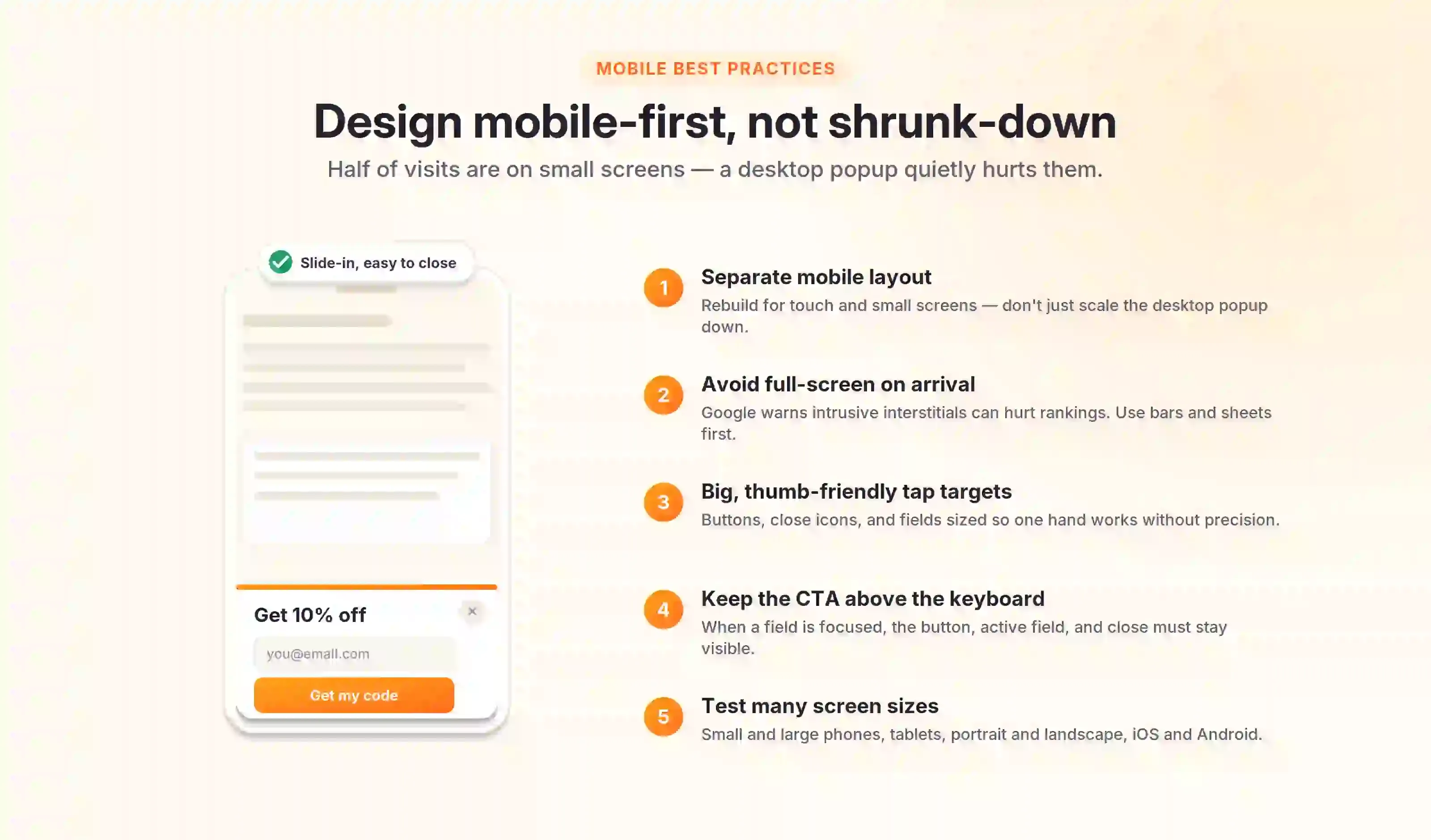
23. Create a separate mobile layout
Don’t just shrink your desktop popup to fit a phone screen.
Mobile screens have less space and rely on touch input. The layout should reflect those limits.
Pro tip: Learn more about Mobile popup.
24. Avoid immediate full-screen mobile popups
A full-screen mobile popup can hide all visible content.
Google advises websites to use smaller banners when possible so visitors and search engines can reach the main content.
25. Make every control easy to tap
Make sure buttons, close icons, checkboxes, and input fields are big enough to tap easily.
Try using the popup with one hand. It should be easy to use without needing perfect finger placement.
26. Check how the keyboard changes the screen
The mobile keyboard might cover up important parts of your popup.
Test what happens when a visitor selects each field. The CTA, active field, error message, and close control should remain available.
27. Test several screen sizes
Previewing your popup on one mobile device isn’t enough.
Test smaller phones, larger phones, tablets, portrait mode, landscape mode, and browser zoom. Also review the popup on both iOS and Android devices when possible.
Popup accessibility best practices
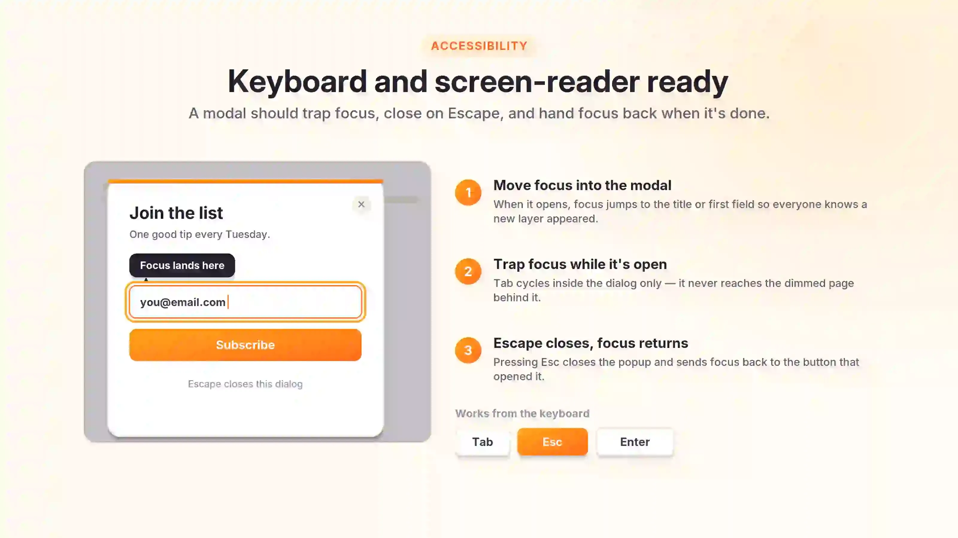
28. Move keyboard focus into the popup
Keyboard focus should move inside a modal when it opens.
This behavior helps keyboard and screen reader users understand that a new interface has appeared. Focus should begin on a logical element, such as the title, first field, or main action.
29. Keep focus inside an active modal
Focus should not reach inactive content behind the modal. Otherwise, keyboard users may interact with elements they cannot clearly see.
The focus order should follow the visual order.
30. Support Escape and return focus after closing
The Escape key should close a standard modal popup.
After the popup closes, focus should normally return to the button or link that opened it. This behavior helps users continue from the same point.
Popup best practices for Shopify stores
Shopify has rules of its own. A popup that works fine on other platform can quietly break here.
Optinify is a Shopify popup app which follows the popup best practices and it is a Shopify native app.
What you will get:
1. One-click install from the Shopify App Store.
2. A/B testing, mini-quiz, exit intent, scroll depth, timer, on page, shopify market, and frequency capping.
3. Customizable canvas, preview mode, free trial.
Popup best practices for measuring performance
Most people track one number: how many emails they got. That tells you almost nothing about whether the popup is working.
You need three layers. What the popup did, what the business got, and what the popup broke.
Check the result of the following metrics:
- View rate
- Interaction rate
- Completion rate
- Dismissal rate
- Bounce and exit changes
- Revenue per visitor
- Lead quality
- Survey completion rate
- Response usefulness
Common mistakes that break popup best practices
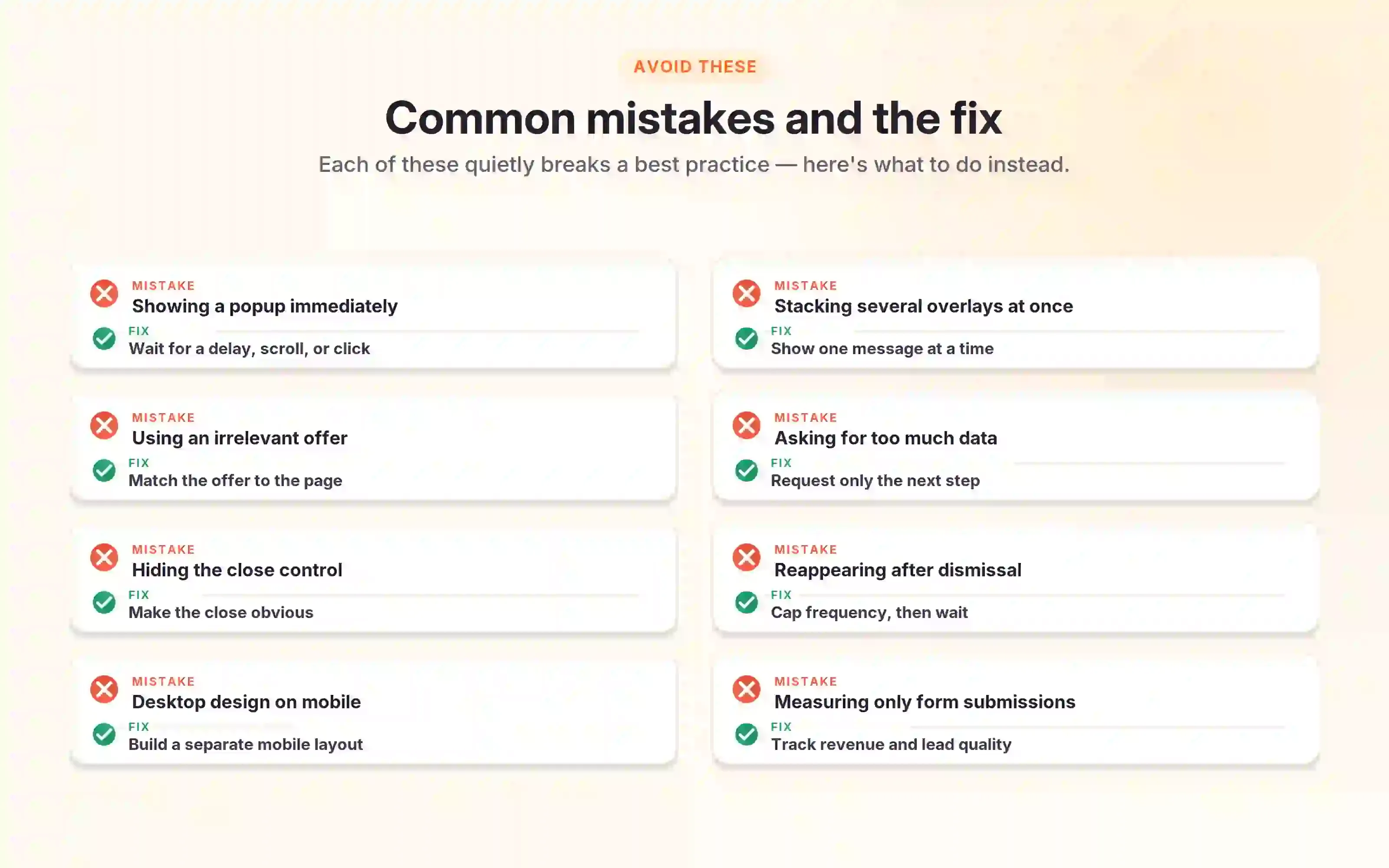
- Showing a popup immediately
- Displaying several overlays at once
- Using an irrelevant offer
- Asking for too much data
- Hiding the close control
- Showing the popup after dismissal
- Using the desktop design on mobile
- Measuring only form submissions
- Copying competitor popup designs
- Using false urgency
Popup Best Practices FAQs
Final thoughts on popup best practices
The best shopify popup apps help visitors rather than just trying to grab their attention.
I think a popup works well when it boosts business results without hurting the website experience. Getting conversions is important, but so are trust, accessibility, usability, and the quality of your leads.
Begin with one helpful campaign. Compare it to a clear starting point, look at the whole customer experience, and make changes based on real results instead of guesses.
What to read next
Ecommerce Popups: 14 Types, Examples & Best Practices
Learn how ecommerce popups work and discover 14 high-converting types. Grow sales without hurting user experience.
Read Article
21 Website Popup Examples for Shopify Stores and Why They Work
Explore 21 website popup examples for Shopify stores. See popup ideas for email capture, cart recovery, discounts, free shipping, SMS, and more.
Read Article
Spin to Win Popup: How Shopify Stores Can Grow Email Signups and Sales
Learn how spin to win popup actually work! Discover the best prizes and perfect timing strategies to boost conversions and grow Shopify sales.
Read Article